Explaining, Persuading & Presenting
Many experts never manage to share what they know in a way anyone can follow. In this article I document everything I know about explaining, persuading and presenting.
Explaining badly
Every one of us has had a concept explained to them very badly at some point. “You have to build houses, hotels ideally. Whatever you do, hold on to the get-out-of-jail-free card until you need it. Feel free to trade the railway stations away. Really important: when you pass Go, remember that you collect money. And if you roll doubles three times in a row, you go to jail!”
What I just explained is Monopoly. But would anyone be able to play the game on the basis of that explanation? Certainly not.
1. Buckets for explaining: context first, then the details
What the Monopoly explanation is missing is buckets. For every piece of information you give me, I need a bucket to sort it into. If there is no bucket, the information lies around unstructured and I cannot place it.
Instead of buckets you can picture a mindmap. For every new piece of information it should be clear which existing node it belongs to. Connect dozens of pieces of information straight to the Monopoly node with no structure, and I will never be able to understand them or file them away.
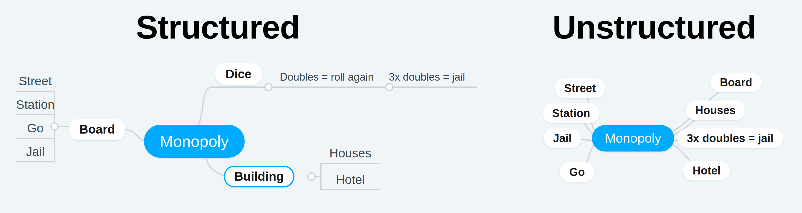
As long as I do not know that there is a board, I cannot file away the information about Go, jail, streets and railway stations. Without knowing that there is a jail, the get-out-of-jail-free card is no use to me. Without the information that I have to roll dice to move a piece, I cannot place the rule about three doubles in a row.
In practice that means you should always try to give a context (the board, rolling dice) and then deliver further details inside that context. It usually makes sense to go broad first. As long as the person in front of you does not know the buckets, no detail has a place it belongs to. For Monopoly that means mentioning that there is a board, that dice are rolled, and that every player has money. Then you can dive into the individual buckets (board, dice, money) and explain the next level of complexity in each. Things that are not relevant to the basic principle, chance cards for example, only get explained in a later round of detail.
2. The pyramid of persuasion: the main idea first, then the evidence
A similar principle is the pyramid of persuasion. You build your arguments like this:
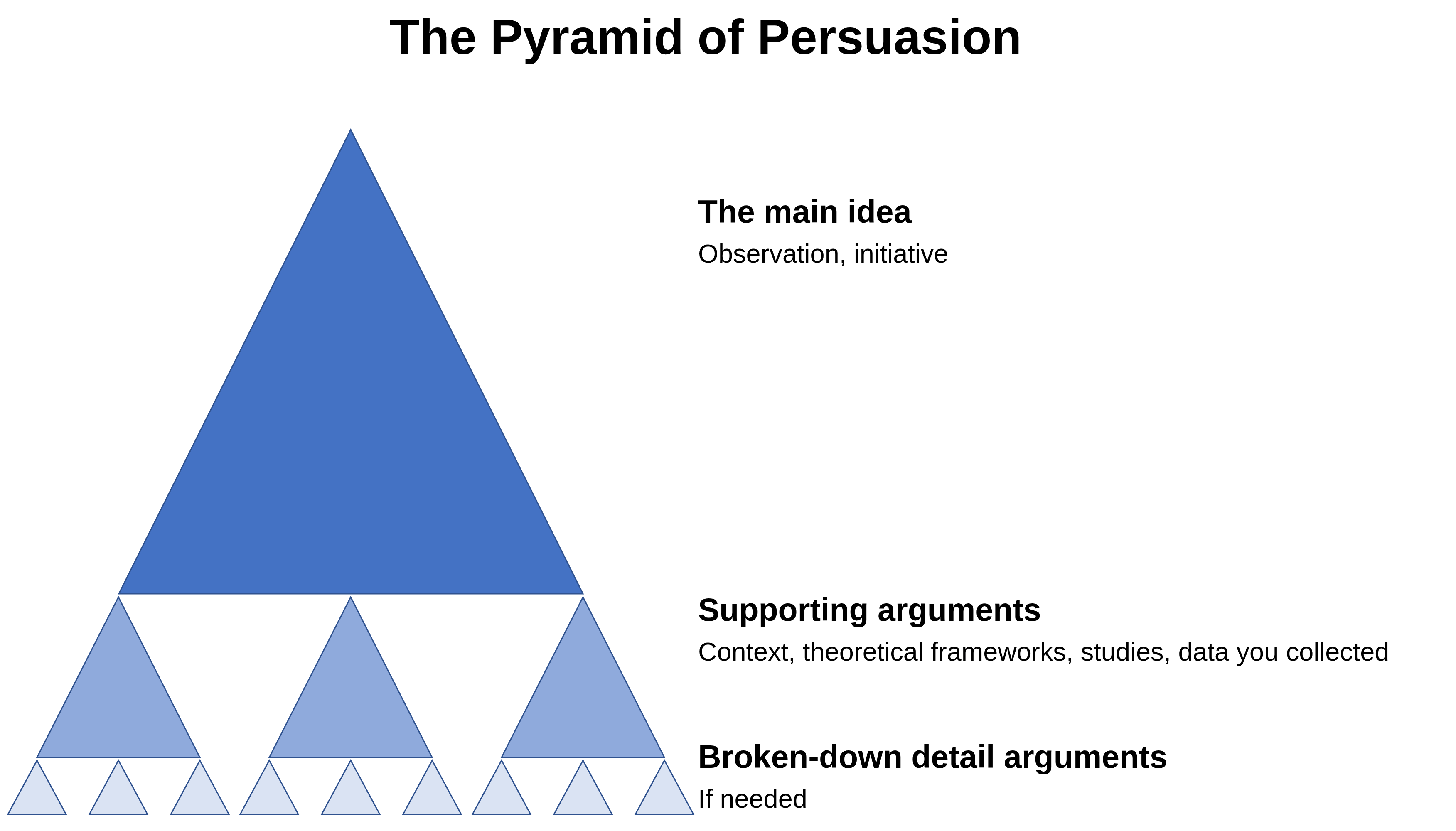
You start with your main idea.
Then you deliver several supporting arguments for your idea, one after another. Those can be theoretical frameworks, studies, data you collected yourself, or simply extra context that helps somebody who is not a subject matter expert understand your main idea.
Where it is needed, you give each of your supporting arguments further, broken-down detail arguments. That can be an explanation of why it makes sense to apply a particular framework, or why your data collection was sound.
This structure makes sense almost every time. Your audience knows what the point is after the first sentence and can then decide for itself how deep to go. In emails, in essays and in spoken communication.
One warning: most emails built this way should probably be meetings or presentations instead.
3. Presenting: one message per slide
I am not going to bore you here with the basics, like “no font size below 20” or “no more than 10 words per slide”. If you are interested in the fundamentals of good presentations, I recommend the slide design tips from Kelvin Newman, the founder of BrightonSEO. He sees hundreds of talks there every year. He knows what works on a slide.
Beyond that there are a few genuinely relevant principles for good presentation slides. Very important: this is not about infotainment at conferences. I am talking about slide decks that may well get sent around without anyone talking over them. In the context of remote work in particular, that kind of presentation keeps getting more important.
Have a message
Before you build a single slide, you should know which message you want to get across with your presentation. If you have no message, you are just somebody standing there talking. Your audience can listen, but afterwards it cannot decide anything and cannot pass anything on.
Write good slide titles
The title of a slide should summarise its entire content. The headings are the only thing many readers read at all. A bad heading is “SEO vs. SEA: long-term ROI”. It names the topic and nothing else, and it forces you to read the slide to find out the result. A good heading is “SEO has a better long-term ROI than SEA”. It names the result, and the slide underneath only has to prove it.
Always assume that when you send somebody a presentation, that person has to show it to their manager to get budget. That manager will probably read nothing but the slide headings.
One trick for checking whether your presentation holds up is to read all the slide headings in order, and nothing else. Does a good story come out of that? If not, go back and work on it.
Another advantage of slide titles written this way is that you can quickly pick the right arguments to tell the story you want to tell.
Every slide needs a conclusion
If nothing follows from a slide, why does it exist? A slide without a conclusion leaves the inference to the reader, and the reader either does not draw it at all or draws a different one than you. Here is an example of what that can look like:
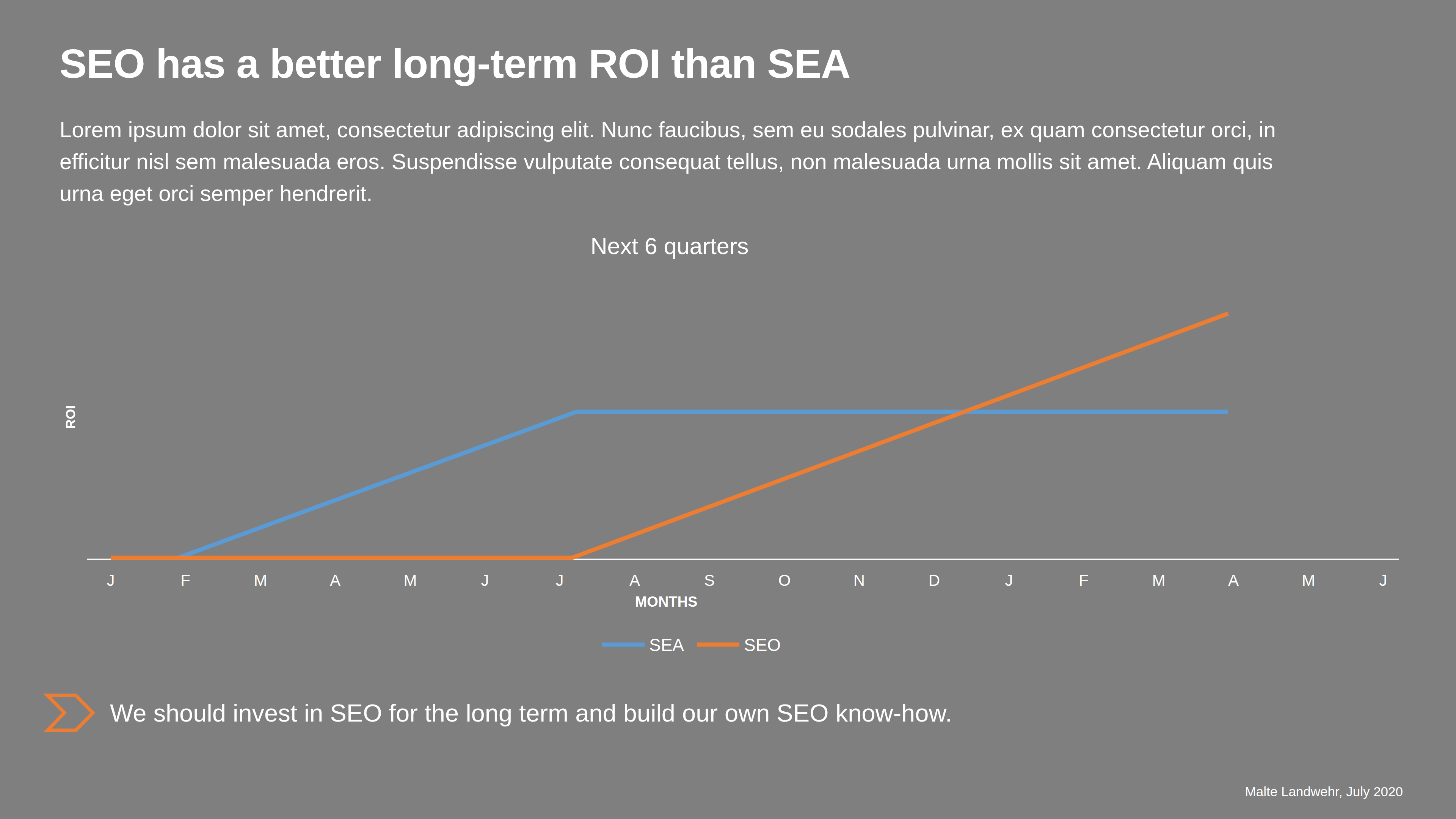
The conclusion is visually set clearly apart from the rest of the slide. Strictly speaking I only have to read the heading and the conclusion. Everything else on the slide exists to prove the statement in the heading and to lead to the conclusion.
That conclusion is the action item for the reader. With it you are not just telling your audience something about x, you are asking them to do y.
The idea first, then the numbers
This rule depends a little on the audience. Most of the time it pays to present the idea first and back it up with numbers and charts afterwards. Concrete numbers trigger a more intense analysis in the people watching and can lead to a lot of questions and discussion. You want those. They show you that your audience is thinking along and where it is getting stuck. But only after you have presented your idea. Before that, they can disrupt the flow badly.
The magic number 7
People can hold an average of 7 things in short-term memory [source]. Ideally that means you use 7 slides and no more, with at most 7 bullet points each and at most 7 words per bullet point. Anything beyond that falls out the back of your audience's head, however good the content is.
This article in German: Erklären, Überzeugen & Präsentieren, the original this translation is based on.